Shapes Object for Canvas
NOTE: For Canvas Series only. For all other series see Shapes Object.
See also: User Interface
See also: Graphic Object Toolbox for Canvas Series
Topic Menu
Overview of the Shapes Object
The following shape drawing primitives allows the user to provide decorative backgrounds, borders and shapes for a screen: Rectangle, Ellipse, Rounded Rectangle, and Line. These objects may be layered and are updated if the dynamic field of an object beneath the drawing primitive is updated. NOTE: Each shape counts as an object in the object-per-page limit.
Shapes can be accessed through the Screens Project Toolbox > Shapes. User must be on a Screen and not in the Main work area in order to see the Objects Project Toolbox items.
Rectangle, Ellipse, and Rounded Rectangle Configuration
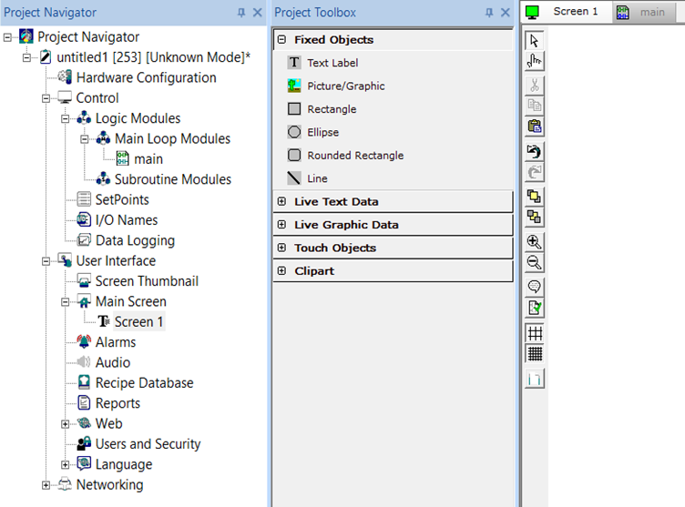
Selecting Rectangle, Ellipse or Rounded Rectangle displays the following shape properties window:
Pen Width - Using this option user can set the width of the pen for the selected shape object. Range is from 1 to 25.
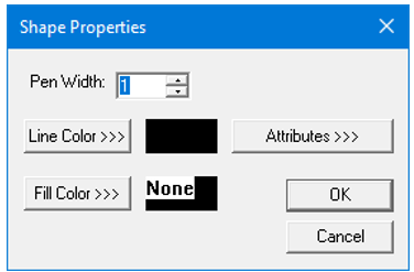
Line Color >>> - Applies the selected color from color picker to the line / boundary of the selected shape object. Selecting this option displays the following color picker window.
Color Picker
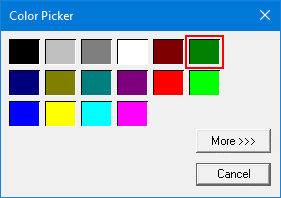
Selecting More >>> displays the following window allowing user to select color apart from default colors available in the above displayed color picker window.
Fill Color>>>
Fills the selected shape object with the selected color / pattern / image. Selecting the Fill Color>>> option displays the following window.
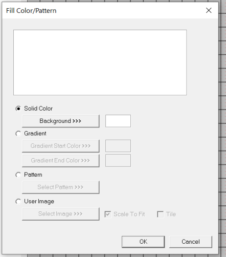
Solid Color
Solid Color – Applies the selected color from color picker as solid background color for the graphic object. Selecting Background >>> displays theColor Picker.
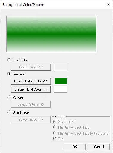
Gradient
Allows user to select start and end color to be configured which in turn displays the configured color as gradient to the background color of graphic objects.
Selecting Gradient Start Color >>> or Gradient End Color >>> displays the Color Picker.
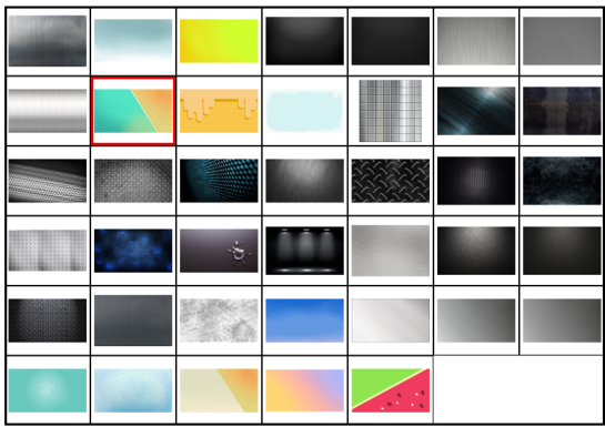
Pattern
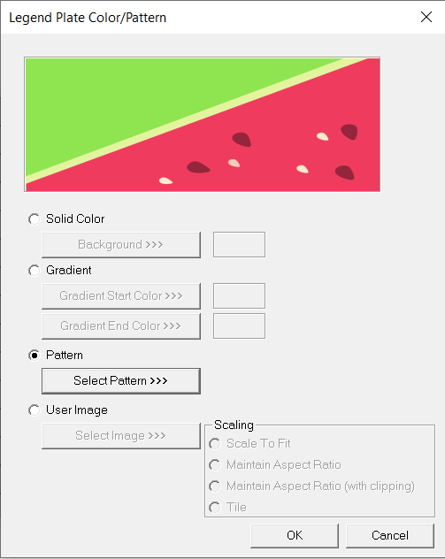
Selecting Select Pattern>>> option displays the following window, where user can select a pattern that will be applied as background for the graphic object.
User Image
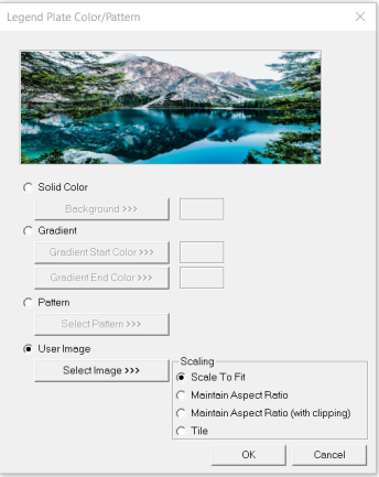
Select Image>>> - Displays windows open dialog for user to select the image from local drive. Following image types are allowed - .bmp, .png, .jpg, .jpeg and .svg.
Scale to Fit – Resizes imported image to match bounds of object. If not selected, the object’s lower-right bounds are recalculated to match the bitmap’s dimensions. If the bitmap is larger than the screen, it is clipped appropriately.
Tile – Selecting this option applies the selected image to the graphic objects background in tile format.
NOTE: If Line color and Fill color is selected as None, then no color will be applied to the object and the object can NO longer be achieved by clicking anywhere in the objects center. To select this type of object, the cursor must be moved to the objects line edge before clicking.
Line Configuration
Double clicking on Line shape object displays the following shape properties window:
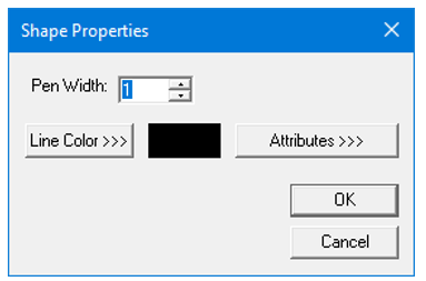
Pen Width - Using this option user can set the width of the pen for the selected shape object. Range is from 1 to 25.
Line Color>>> - Applies the selected color from color picker to the line of the selected shape object. Selecting this option displays the Color Picker.
Attributes >>>
Selecting the Attributes >>>button displays the following window:
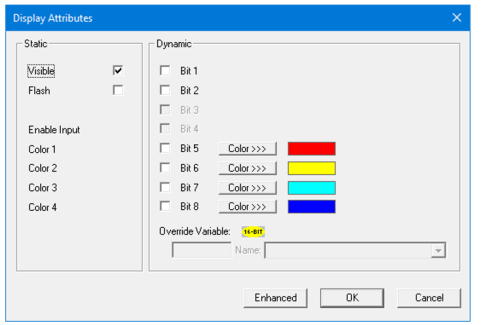
Static
Visible
-
Non-touch units* - all objects are always visible, so as a result both the static and dynamic override fields will be grayed out.
-
Touch units** - the visibility attribute may be set as static or dynamic.
-
*Non-touch units include X2, XLE, and XLEe.
**Touch Units include all XL series, Prime Series, and Micro OCS series controllers.
-
When the attribute is statically set to ON, the object is always visible and always responds to touch signals.
-
When the attribute is statically set invisible (unchecked) the object is not drawn but if the object is the front most object it responds to touch signals. For example, placing a statically invisible screen jump object in front of a bitmap allows the bitmap to be drawn but touching the location of the invisible screen jump causes the screen jump action to be performed.
-
When this attribute is dynamically enabled the visibility of the object is controlled by the associated bit in the override register. When the bit is ON the object is drawn and operates normally. When the bit is OFF the object is not drawn and does respond to any touch signals.
Flash – When statically set, an object will ’Flash’ the data display continuously or the animation ICON when the associated control register is in the ON state. When dynamically overridden, a three-state display can be created: OFF, ON solid and ON flash, depending both on the state of the control register and the Override Register.
Enable Input – This attribute, optionally available only as dynamically overridden, allows the object or the object editor to ignore keystrokes directed to that object. This allows run-time determination on whether to restrict input access to that object. This allows the user to create operator privilege or in-motion lockout of object modification. If this box is NOT checked, the associated object always accepts input.
Dynamic
Color – This attribute allows some objects to dynamically change colors. Up to four additional colors can be selected for an object. If none of the color attribute override bits are set the object defaults to the color chosen in the main object properties.
Override variable – This register / variable is used to control the dynamic properties like visible, Flash, Enable Input and Colors.
Enhanced - Selecting Enhanced button displays the following window:
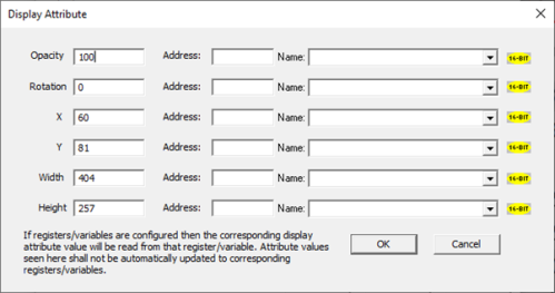
This option is used for configuring the different display attribute of graphic objects mentioned below. The following options can be configured either using constant values or via register / variable.
-
Opacity – User can configure the display opacity of graphic object. Range is 0 to 100.
-
Rotation – User can configure at what degree the object should appear rotated. Range is -180 to 180.
-
X and Y axis – User can configure at what X and Y axis the object should be placed on the screen. Range depends on the model selected.
-
Width and Height – User can configure at what width and height the object should be displayed on the screen. Range depends on the model selected.
Return to the Top: Shapes Object for Canvas