Lamp/Indicator Object for Canvas 
Note: For Canvas Series only. For all other series see Lamp Object .
See also: User Interface
See also: Graphic Object Toolbox for Canvas Series
Topic Menu
Overview of the Lamp/Indicator Object
Displays and formats an indicator that is associated with a source register/variable. Lamp types includes Round, Square, Bulb, Radio Button, Check Box or Empty Square, and User defined. The
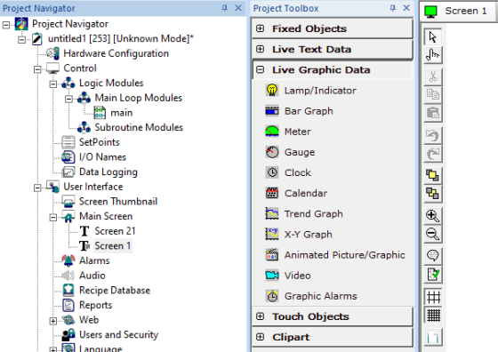
Lamp Object can be accessed through the Screens Project Toolbox > Live Graphic Data > Lamp/Indicator. User must be on a Screen and not in the Main work area in order to see the Objects Project Toolbox items. Select the Lampobject and drag to a new screen. This object can be placed anywhere on the screen.
Lamp/Indicator Configuration
Object (animation) ICON reflects current state of Control Register. For the round and square types, the area with-in the boundary is filled with the line color when ON and with the background color when OFF. For the bulb type, light rays will be drawn when ON and erased when OFF. For user defined option ON image will get displayed when Control Register is high and OFF image will get displayed when control register is low.
Controller Register
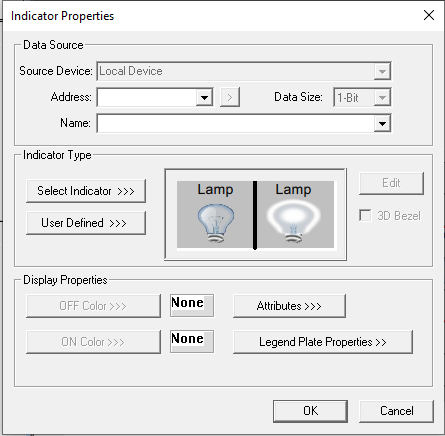
Data Source
External Registers - To view data on the screen from an external device connected using configurable protocols, it is required to map the data into OCS registers / variables and then display the data on the screen. The external registers (registers / variables of the device connected to OCS through serial / Ethernet protocols) can be directly accessed from the graphics objects. This provides three major benefits:
-
Ease of programming
-
Reduced register / variable usage
-
Data transferred only when required
Accessing External Registers - Configure the protocol for communication with the external device.
Note: The scan list configuration is not required if the user wants to only access the data of external device from the OCS screens.
-
Place the graphics object for displaying the data and double click to configure its properties. Select the required protocol from the Data Source dropdown.
-
Enter the parameter address / variables of the external device parameters. Select the register / variable width for the configured external parameter.
-
When the OCS switches to the screen having objects with external registers in RUN mode, the data is polled from the external device and displayed on the screen.
Local Device - This section specifies the main OCS register / variable that is associated with the object. Depending on the individual object’s functionality, this register / variable may be read, written or both by the object. This section may contain up to three fields. The first field contains the action register / variable designation (i.e., %R12 / Var_1). The second field allows the register selection by alias name. The third field is only present on objects that accept multiple data sizes and is used to select binary (1bit) or analog (8, 16 or 32 bits).
Indicator Type
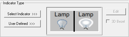
Select Indicator >>> opens the following screen:
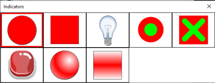
Specify the type of display (animation) icon: Round, Square, Bulb, Round Button, Check Box or Empty Square.
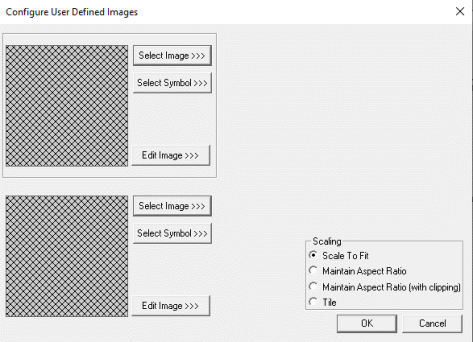
User Defined
User can select an Image or symbol from the Symbol Factory as display (animation) icon.
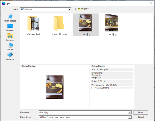
Select Image >>> - Selecting Select Image>>> displays the following windows. Open dialog for user to select the image from local drive. Following image types are allowed - .bmp, .png, .jpg, .jpeg and .svg.
OR
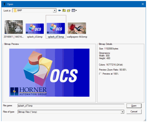
Note: The last used directory for selecting bitmaps is retained the next time the dialog is opened.
Edit Image -
Note: the Tools/Set Bmp Editor must be configured to the file location of a bitmap (bmp) editor. Generally this is MS Paint which is supplied as part of the Windows or NT operating system.
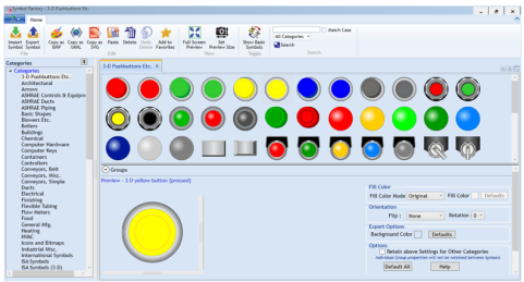
Select Symbol - Opens the following symbol factory for user to select appropriate symbols available from the symbol factory.
Display Properties for Lamp
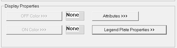
Attributes >>>
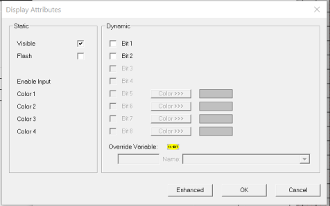
Static
Visible
-
Non-touch units* - all objects are always visible, so as a result both the static and dynamic override fields will be grayed out.
-
Touch units** - the visibility attribute may be set as static or dynamic.
-
*Non-touch units include X2, XLE, and XLEe.
**Touch Units include all XL series, Prime Series, and Micro OCS series controllers.
-
When the attribute is statically set to ON, the object is always visible and always responds to touch signals.
-
When the attribute is statically set invisible (unchecked) the object is not drawn but if the object is the front most object it responds to touch signals. For example, placing a statically invisible screen jump object in front of a bitmap allows the bitmap to be drawn but touching the location of the invisible screen jump causes the screen jump action to be performed.
-
When this attribute is dynamically enabled the visibility of the object is controlled by the associated bit in the override register. When the bit is ON the object is drawn and operates normally. When the bit is OFF the object is not drawn and does respond to any touch signals.
Flash – When statically set, an object will ’Flash’ the data display continuously or the animation ICON when the associated control register is in the ON state. When dynamically overridden, a three-state display can be created: OFF, ON solid and ON flash, depending both on the state of the control register and the Override Register.
Dynamic
Override variable – This register / variable is used to control the dynamic properties like visible, Flash, Enable Input and Colors.
Enhanced - Selecting Enhanced button displays the following window:
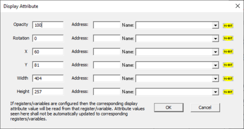
This option is used for configuring the different display attribute of graphic objects mentioned below. The following options can be configured either using constant values or via register / variable.
-
Opacity – User can configure the display opacity of graphic object. Range is 0 to 100.
-
Rotation – User can configure at what degree the object should appear rotated. Range is -180 to 180.
-
X and Y axis – User can configure at what X and Y axis the object should be placed on the screen. Range depends on the model selected.
Width and Height – User can configure at what width and height the object should be displayed on the screen. Range depends on the model selected.
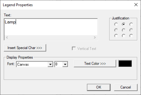
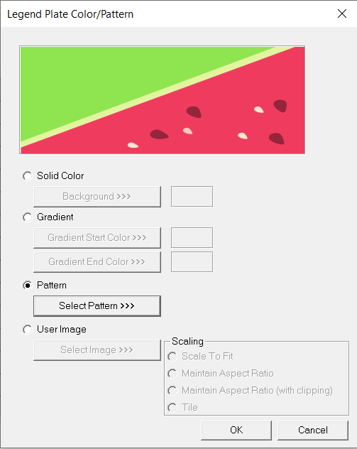
Legend Plate Properties >>>
Border, Background, line color, font and justification can be set in Legend Plate properties. Selecting Legend Plate Properties >>> opens the following dialog:
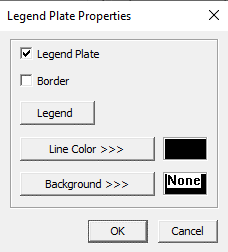
Legend Plate - This option is ON by default. Unchecking this option turns off the display of the legend, and border checkbox (only available on color units).
Legend
-
Text – User can configure a descriptive text (legend) to be included with-in the objects bounding rectangle. Returns may be inserted for multiple lines.
-
Justification – This option is used to display the legend text in the configured position within a graphic object.
-
Font – User can select the available fonts / font size to be applied to legend text
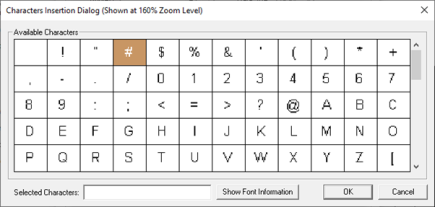
Insert Special Char >>>
Selecting this option displays the following window wherein user can select different fonts / special characters available to be added in legend:
Text Color>>> - Displays Color Picker dialog for user to select the color and this will be applied to the legend and line (boundary) of the graphic object.
Line Color >>> - Displays Color Picker dialog for user to select the color and this will be applied to the legend and line (boundary) of the graphic object.
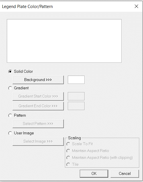
Background Color / Image >>>
Selecting Background Color / Image >>> button displays the following window.
Note: Only Solid color will be available and all other options like Gradient, Pattern and User image will be grayed out if the graphic object is in non-editable mode.
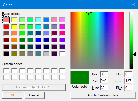
Color Picker
Applies the selected color from color picker as solid background color for the graphic object.
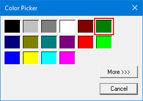
Selecting More >>> displays the following window allowing user to select color apart from default colors available in the above displayed color picker window.
Gradient
Allows user to select start and end color to be configured which in turn displays the configured color as gradient to the background color of graphic objects.
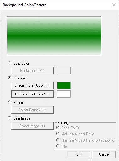
Selecting Gradient Start Color >>> or Gradient End Color >>> displays the Color Picker.
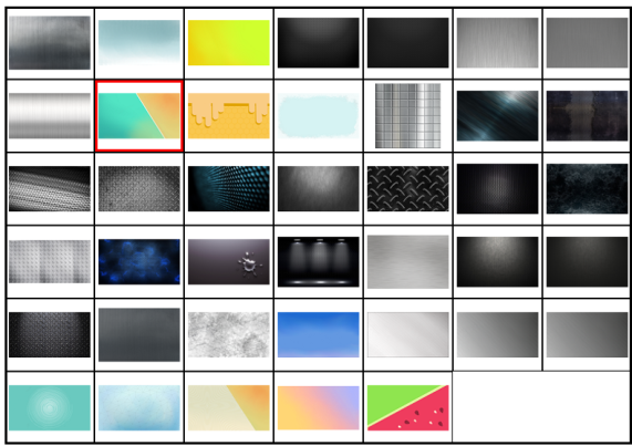
Pattern
Selecting Select Pattern>>> option displays the following window, where user can select a pattern that will be applied as background for the graphic object.
User Image
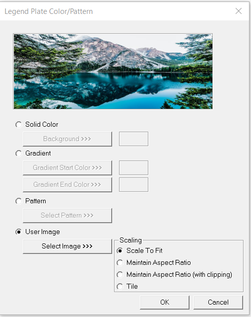
Select Image>>> - Selecting “Select Image>>>” displays windows open dialog for user to select the image from local drive. Following image types are allowed - .bmp, .png, .jpg, .jpeg and .svg.
Scale to Fit – Resizes imported image to match bounds of object. If not selected, the object’s lower-right bounds are recalculated to match the bitmap’s dimensions. If the bitmap is larger than the screen, it is clipped appropriately.
Maintain Aspect Ratio – Selecting this option maintains the aspect ratio of the selected image and applies to the graphic objects background.
Maintain Aspect Ratio (with clipping) - Selecting this option maintains the aspect ratio with clipping the selected image and applies to the graphic objects background.
Tile – Selecting this option applies the selected image to the graphic objects background in tile format.
Return to the Top: Lamp/Indicator Object for Canvas