Button/Switch Object
Note: For Canvas Series see Switch Object for Canvas .
See also: User Interface
See also: Graphic Object Toolbox for Canvas Series
Topic Menu
Overview of Button/Switch Object
The Switch Object displays and formats a switch that is associated with a write register. Switch type includes push buttons, toggle switches, multi-position switches and user-defined switches.
The Switch Object can be accessed through the Home > Project Toolbox > Touch Objects > Button/Switch. User must be on a Screen and not in the Main work area in order to see the Objects Project Toolbox items. Select the Switch object and drag to a new screen. This object can be placed anywhere on the screen.

For the toggle action, any change in the keypress state <or> for the remaining actions, any low-to-high change in the keypress state will cause the object to generate that specified action in the controller register. If the keypress source is an auxiliary register, a change will not be recognized until the first low-to-high transition. This prevents a Function key (F1-F10) assigned as the keypress source from generating an erroneous action on entry to this screen should that same key been used to generate the screen jump.
For standard, round and square types, the outer area of the object’s (animation) ICON will indicate when the Controller Register is ON or OFF. This outer area (bezel) is filled with the Line Color when ON and filled with the Background Color when OFF. For the rocker type, the upper portion will appear pressed when ON and the lower portion will appear pressed when OFF. Note that this animation follows the state of the control register and not the actual keypress source. Should the network or ladder rung modify the state of the control register, that change would be reflected in the animation. Optionally, the inner area may also show an On/Off state caption. Both the ON and OFF state strings can be re-defined and may follow the state of the switch (controller register) or a target device (auxiliary register) that may be controlled by more than just this switch register.
Return to the Top: Button/Switch Object
Switch Object Configuration
Double clicking on the Switch object displays the following control from Logic address.
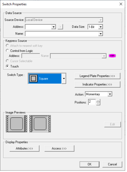
Controller Register
This object will accept register types on bit boundaries and 8 bit.
Data Source:
External Registers - To view data on the screen from an external device connected using configurable protocols, it is required to map the data into OCS registers / variables and then display the data on the screen.
-
The external registers (registers / variables of the device connected to OCS through serial / Ethernet protocols) can be directly accessed from the graphics objects. This provides three major benefits:
-
Ease of programming
-
Reduced register / variable usage
-
Data transferred only when required
-
Accessing External Registers - Configure the protocol for communication with the external device.
Note: The scan list configuration is not required if the user wants to only access the data of external device from the OCS screens. Place the graphics object for displaying the data and double click to configure its properties.
Keypress Source
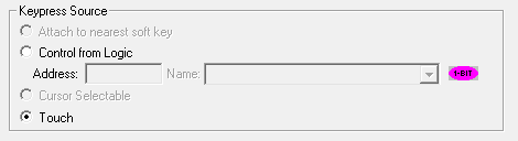
Specifies the location of the source for the switch. This may be either a touch screen or control from Logic address.
Switch Type
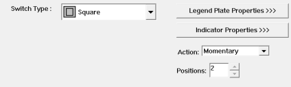
Specify the type of display icon: Standard, Round, Square, Rocker, 3D Button, Rocker Vert.
3D Button

Other Buttons and Switches
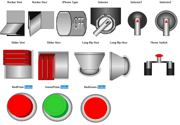
Note:
-
Rocker Vert, Rocker Horz, iPhone type, Slider Vert, Slider Horz, Long flip Vert, Long flip Horz, RedPress button, GreenPress button and RedGreen button switch types can be configured as 1 bit or 8 bits as they support 2 positions.
-
Selector and Throw switch should be configured as 8 bits as they support 3 positions.
-
Selector1 and Selector2 switches should be configured as 8 bits as they support 8 positions.
Switch Action
Specifies the switch action emulated when the keypress source is pressed.
Momentary - Controller register will be set ON when key is down. When key is released, controller register will be set OFF.
ON - Controller register will be set ON when key is pressed.
OFF - Controller register will be set OFF when key is pressed.
Toggle - Controller register will be toggled when key is pressed.
Legend >>>
Border, Background, line color, font and justification can be set in Legend Plate properties. Selecting Legend button displays the following window:

Select Legend to open the screen below:

Text – User can configure a descriptive text (legend) to be included with-in the objects bounding rectangle. Returns may be inserted for multiple lines.
Justification – This option is used to display the legend text in the configured position within a graphic object.
Font – User can select the available fonts / font size to be applied to legend text.
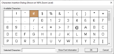
Insert Special Char >>> - Selecting this option displays the following window wherein user can select different fonts / special characters available to be added in legend:
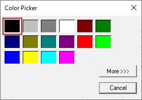
Line Color>>> - Selecting Line Color>>> opens the Color Picker dialog.
Color Picker
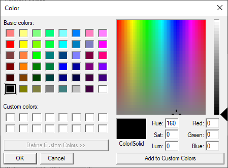
Selecting More >>> displays the following window allowing user to select color apart from default colors available in the above displayed color picker window.
Background >>>
Selecting Background>>> opens the following dialog:

Background >>> - Displays the Color Picker window.
Solid Color – Applies the selected color from color picker as solid background color for the graphic object. Selecting Background >>> displays the following Color Picker window.
Gradient - Allows user to select start and end color to be configured which in turn displays the configured color as gradient to the background color of graphic objects. Selecting Gradient Start Color >>> or Gradient End Color >>> displays the Color Picker window:
Indicator Properties >>>
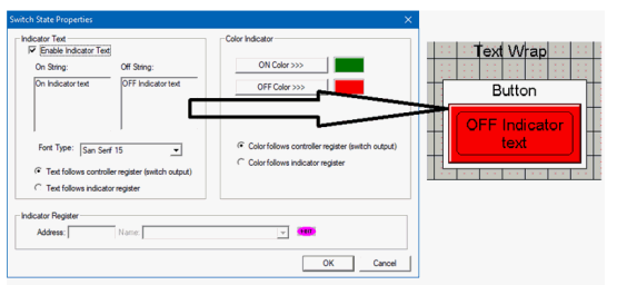
Pressing the Indicator Properties button brings up the following configuration window.
When checked, the animation ICON will contain one of two text strings designating either the current state of the controller register (switch output) or, optionally, the current state of the indicator register if so configured. The On and Off string text is specified as well as a font size. From Cscape 9.90 and firmware 15.20 onwards, text wrap and multi-line support on button text are supported.
Text Wrap appears as shown below:
Multi-line text appears as shown below:

Color Indicator
The color of the switch face can be specified to match any color scheme desired. An ON Color and an OFF Color are specified and also whether the color follows the current state of the controller register (switch output) or the current state of the Indicator register.
Indicator Register
Configuring this register becomes an option if either the Indicator Text or Color Indicator is configured to follow the Indicator Register. This is a register separate from the controller register that can be used to control either the Indicator Text or the Color Indicator or both.
Image Previews

The preview of the configured switch will be displayed here.
Display Properties
Attributes >>>
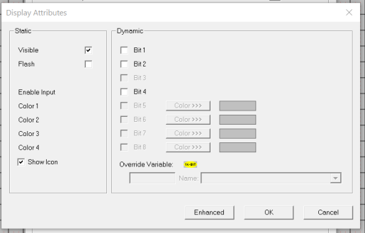
Static
Visible
-
Non-touch units* - all objects are always visible, so as a result both the static and dynamic override fields will be grayed out.
-
Touch units** - the visibility attribute may be set as static or dynamic.
-
*Non-touch units include X2, XLE, and XLEe.
**Touch Units include all XL series, Prime Series, and Micro OCS series controllers.
-
When the attribute is statically set to ON, the object is always visible and always responds to touch signals.
-
When the attribute is statically set invisible (unchecked) the object is not drawn but if the object is the front most object it responds to touch signals. For example, placing a statically invisible screen jump object in front of a bitmap allows the bitmap to be drawn but touching the location of the invisible screen jump causes the screen jump action to be performed.
-
When this attribute is dynamically enabled the visibility of the object is controlled by the associated bit in the override register. When the bit is ON the object is drawn and operates normally. When the bit is OFF the object is not drawn and does respond to any touch signals.
Flash – When statically set, an object will ’Flash’ the data display continuously or the animation ICON when the associated control register is in the ON state. When dynamically overridden, a three-state display can be created: OFF, ON solid and ON flash, depending both on the state of the control register and the Override Register.
Enable Input – This attribute, optionally available only as dynamically overridden, allows the object or the object editor to ignore keystrokes directed to that object. This allows run-time determination on whether to restrict input access to that object. This allows the user to create operator privilege or in-motion lockout of object modification. If this box is NOT checked, the associated object always accepts input.
Dynamic
Color – This attribute allows some objects to dynamically change colors. Up to four additional colors can be selected for an object. If none of the color attribute override bits are set the object defaults to the color chosen in the main object properties.
Override variable – This register / variable is used to control the dynamic properties like visible, Flash, Enable Input and Colors.
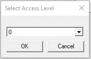
Access Level>>>
Users can assign access level to this object. Selecting the Access>>> option opens up the Select Access Level window. This where the user can select an access level from 0 to 7 in the dropdown, as shown. Users logged in with the configured access level (of the ASCII object) are the only ones that will have access to the object.
Return to the Top: Button/Switch Object