User Manager Object
Topic Menu
Overview of the User Manager Object
The User Manager object provides access to the User Manager interface on the OCS device for performing supported user-management operations at runtime.
The User Manager object can be accessed through: Home > Project Toolbox > Touch Objects > User Manager
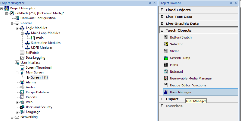
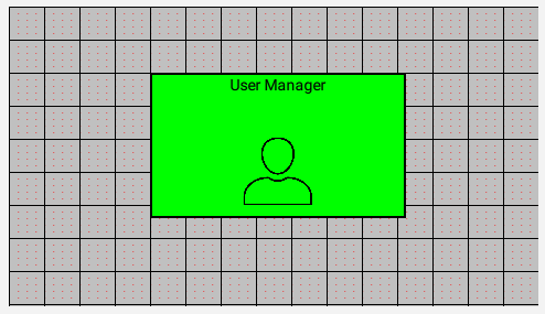
Note: The user must be on a Screen and not in the Main work area to view the Touch Objects in the Project Toolbox.
Important Notes The User Manager object is enabled when Enhanced User Access is configured. The object remains disabled when Legacy User Access is selected under Users and Security.
User Manager Object Properties
Double-click the User Manager object to open the User Manager Object Properties window.
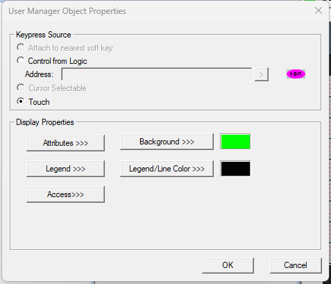
The User Manager Object Properties window provides options to configure the input method and display properties of the object.
Keypress Source
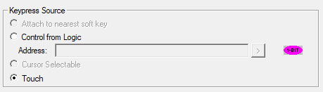
The following options are available:
-
Control from Logic
-
Touch
Select the required option based on the application requirements.
Touch: When Touch is selected, the User Manager object is opened by touching the object on the OCS device.
Control from Logic: When Control from Logic is selected, the User Manager object can be opened using an auxiliary input controlled through application logic.
-
Specify the required Boolean tag or variable in the Address field.
-
When the configured Boolean input is ON, the User Manager object can be opened on the OCS device.
-
When the configured Boolean input is OFF, the User Manager object cannot be opened.
-
This option can be used when the application requires the User Manager object to be enabled or disabled through application logic.
See also: Runtime Operation of the User Manager Object: Runtime Operation of the User Manager Object
Display Properties
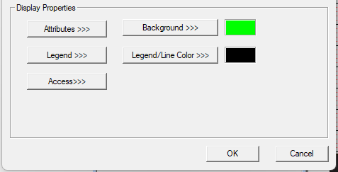
The Display Properties section provides options to configure the appearance and access of the User Manager object.
The following options are available:
-
Attributes >>>
-
Background >>>
-
Legend >>>
-
Legend/Line Color >>>
-
Access >>>
Attributes >>>
Selecting Attributes >>> opens the Display Attributes window.
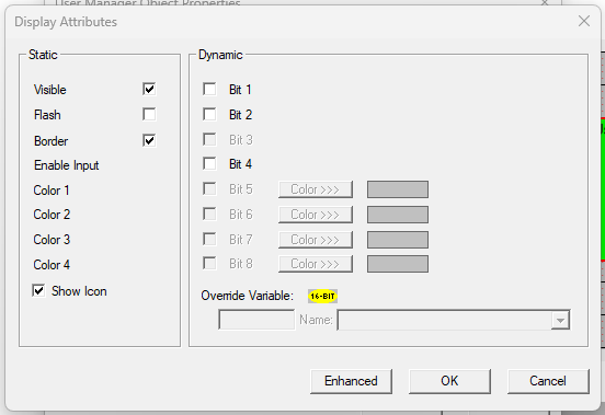
The Display Attributes window provides static and dynamic options for controlling the appearance and input behavior of the User Manager object.
Static
-
Visible: For Touch Units, the visibility attribute may be set as static or dynamic.
Note: Touch Units include all Prime Series, Prime Series, and Micro OCS series controllers.
When the attribute is statically set to ON, the object is always visible and always responds to touch signals.
When the attribute is statically set to invisible (unchecked), the object is not drawn, but if the object is the front-most object, it responds to touch signals. For example, placing a statically invisible Screen Jump object in front of a bitmap allows the bitmap to be drawn, while touching the location of the invisible Screen Jump causes the Screen Jump action to be performed.
When this attribute is dynamically enabled, the visibility of the object is controlled by the associated bit in the override register. When the bit is ON, the object is drawn and operates normally. When the bit is OFF, the object is not drawn and does not respond to touch signals.
Flash
When statically set, an object will flash the data display continuously or the animation icon when the associated control register is in the ON state.
When dynamically overridden, a three-state display can be created: OFF, ON solid, and ON flash, depending on the state of the control register and the Override Register
Border
This attribute, available only statically, provides a decorative border (rectangle) drawn around the inside of the object's bounding rectangle.
This border can be removed to allow either a more elaborate border to be drawn using drawing primitives or no border to be displayed.
Enable Input
This attribute, optionally available as dynamically overridden, allows the object or the object editor to ignore keystrokes directed to that object.
This allows runtime determination of whether input access to the object should be restricted. This can be used to provide operator privilege or in-motion lockout of object modification.
If this option is not checked, the associated object always accepts input.
Dynamic → Color
The Color attribute allows supported objects to dynamically change colors.
Up to four additional colors can be selected for an object. If none of the color attribute override bits are set, the object uses the color selected in the main object properties.
Dynamic → Override Variable
The Override Variable is the register or variable used to control the dynamic properties of the object, such as Visible, Flash, Enable Input, and Colors.
This option is used for configuring the different display attribute of graphic objects mentioned below. The following options can be configured either using constant values or via register / variable.
Legend
Selecting Legend >>> opens the Legend Properties window.
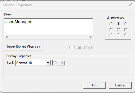
The Legend Properties window allows the user to configure the text displayed within the object's bounding rectangle.
Text
The Text field allows the user to configure descriptive text (legend) to be displayed within the object's bounding rectangle.
Returns can be inserted to display the legend on multiple lines.
Justification
The Justification option is used to display the legend text in the configured position within the graphic object.
Font
The Font option allows the user to select the available font and font size to be applied to the legend text.
Inster Special Char>>> Button
Selecting Insert Special Char >>> opens the Characters Insertion Dialog.
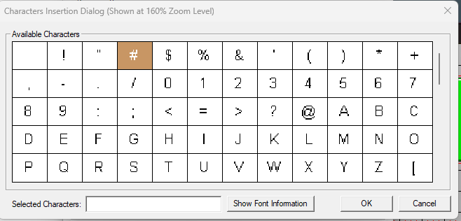
This window allows the user to select available fonts and special characters to be added to the legend.
Access >>>
Selecting Access >>> opens the Select Access Level window.
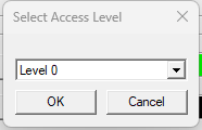
The user can select an access level from Level 0 to Level 7 from the drop-down list. Only a user logged in with the configured access level of the graphic object can access the User Manager object.
Note: The default access level is Level 0 (Zero) for all graphic objects that support access-level configuration.
Background>>>
Selecting the Background>>> button opens the following screen:
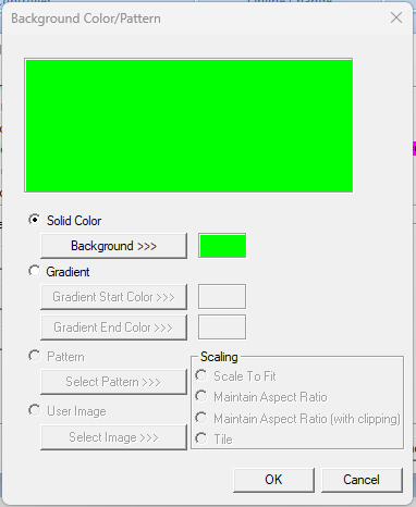
Select Solid Color>>>Background>>> to open the Color Picker.
Gradient>>>
Allows user to select start and end color to be configured which in turn displays the configured color as gradient to the background color of graphic objects.
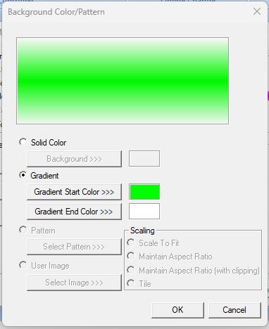
Select Gradient Start Color >>> or Gradient End Color >>> to open the Color Picker.
Legend/Line Color>>>
Selecting Legend/Line Color >>> opens the Color Picker.
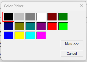
The user can select a color from the available colors. The selected color is applied to the legend and line (boundary) of the graphic object.
Color Picker
The Color Picker provides a set of default colors that can be selected for the legend and line color.
More >>>
Selecting More >>> opens the extended color selection window.
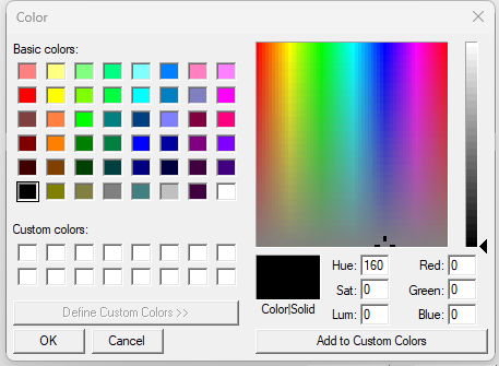
This window allows the user to select a color other than the default colors available in the Color Picker.
Runtime Operation of the User Manager Object
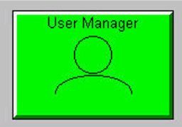
The User Manager object provides a runtime interface for viewing and managing users, groups, and password policy on the OCS device. The available operations depend on the permissions of the currently logged-in user.
Note: Existing User Login Object
The existing User Login Object available on Prime can also be used to log in and log out Enhanced Users on the OCS device.
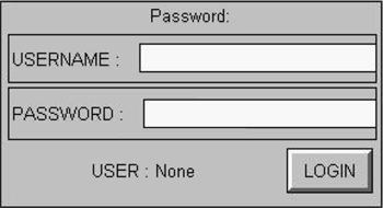
Detailed Enhanced User Access information and user-management functions are available only through the User Manager Object.
User Manager Object Screen
Touch or click the User Manager object on the OCS device to open the User Manager interface.
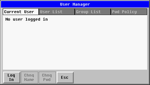
When no user is logged in, the Current User tab displays No user is logged in.
Logging In
Press Log In to start the login process.
The User Manager displays the Enter Username keypad.
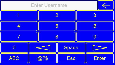
Enter the username and password and press Login to log in.
The User Manager then displays the Enter Password keypad.
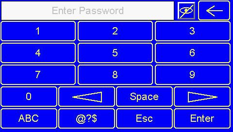
Enter the password and press Enter to log in.
Show/Hide Password
Click the eye icon to show the entered password. Click it again to hide the password and display it as masked characters. After successful login, the Current User tab displays the details of the logged-in user.
Current User
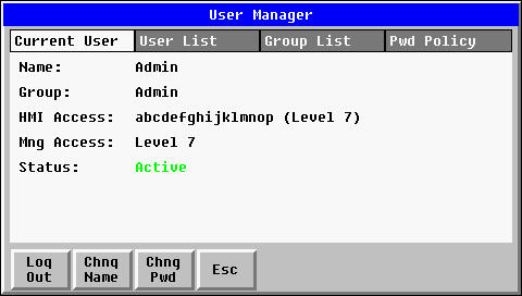
The following information is displayed:
-
Name – Username of the logged-in user.
-
Group – Group to which the user belongs.
-
HMI Access – HMI Access Level of the user's group.
-
Mng Access – User Management Access Level of the user's group.
-
Status – Current status of the user.
The user status can be Active or Inactive.
The HMI Access Level and User Management Access Level can also be displayed using their configured Access Level Alias names.
Change Name
The Chng Name button is available when Allow Edit on Device is enabled for the Username field in Cscape. Press Chng Name to change the username of the currently logged-in user.
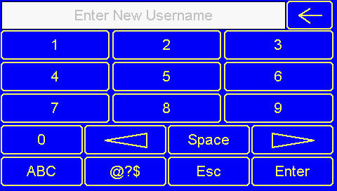
Enter the new username and select Save.
After the username is changed, the current user is automatically logged out. The user must log in again using the new username.
Change Password
The Chng Pwd button is available when Allow Edit on Device is enabled for the Password field in Cscape.
Press Chng Pwd to change the password of the currently logged-in user.
Enter Current Password
Enter the current password and press Enter.
Show/Hide Password
The Current Password, New Password and Confirm Password fields include Show/Hide Password (eye) icons.
Click the eye icon to temporarily display the entered password. Click it again to hide the password and return to the masked view.
After the password is successfully changed, the current user is automatically logged out. The user must log in again using the new password.
User List
The User List tab displays the users that are available to the currently logged-in user based on the applicable HMI Access Level and User Management Access Level.
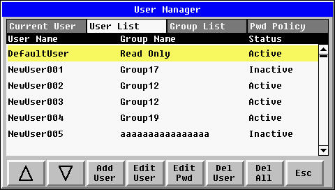
The User List displays
-
User Name
-
Group Name
-
Status
The list can contain users configured in Cscape as well as users added at runtime.
Important Notes:
Both HMI Access Level and User Management Access Level are considered when determining which users are displayed.
For example, a user with a low HMI Access Level and high User Management Access Level cannot view a user belonging to a group with a higher HMI Access Level and lower User.
Management Access Level
Therefore, having a high User Management Access Level alone does not allow the user to view or manage users who have a higher HMI Access Level.
Up/Down Buttons
The Up and Down buttons are used to move through the User List.
Add User
The Add User button allows an authorized user to add a new user at runtime.
Enter Username
Press Add User
Enter the Username and press Enter.
Enter the Password and press Enter
Confirm the Password.
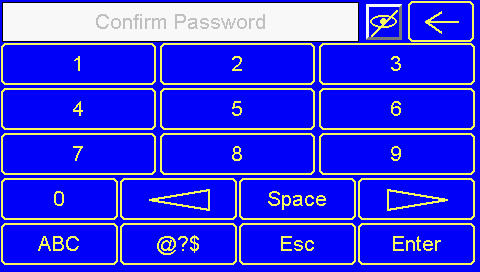
Enter the password again and press Enter.
Show/Hide Password
The Enter Password and Confirm Password fields include Show/Hide Password (eye) icons. Click the eye icon to display the entered password. Click it again to hide the password and display it as masked characters.
Select Group
Select the Group field to display the available groups.
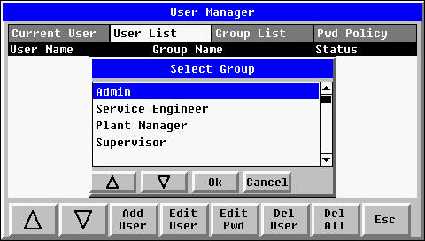
Only groups that the current user is permitted to access are displayed. Group visibility is based on the current user's HMI Access Level and User Management Access Level.
Important Notes:
A user belonging to the Admin group can add a new user to the Admin group.
For users belonging to other groups, adding a new user to the same group is restricted. The user can add users only to lower-level groups permitted by their access levels.
If the user logged in attempts to add a user to the same group, an Insufficient Permission message is displayed.
Set Status
The User Manager then displays the Set Status window.
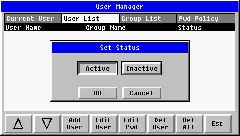
Select:
-
Active – The new user can log in.
-
Inactive – The new user cannot log in.
Select Save to add the user.
First Login for a Runtime-Created User
When a new user is added at runtime, the user is required to reset the password during the first login.
On the first login, the device prompts the user to reset the password. After the password is reset successfully, the user can log in using the new password.
After the user is added successfully, the new user is added to the User List after the existing users.
Edit User
The Edit User button allows an authorized user to change the group and status of a selected user.
Select a user from the User List and press Edit User.
Select Group
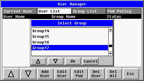
Select the required group and press OK.
Only groups that the current user is permitted to assign are displayed.
Select Status
Select Active or Inactive and press OK.
An authorized user can also change the status of a locked user to Active. For example, if a user is locked because the maximum invalid login attempts have been exceeded, an authorized user having highest Management access level can change the status to Active so that the user can log in again.
Access Restriction
The current user can change the group and status of users having the lower User Management Access Level, subject to the HMI Access Level restriction. A logged-in user cannot modify the configuration of a user belonging to the same group.
Groups that do not satisfy the required access permissions are not displayed for selection. In particular, a user with a high User Management Access Level cannot manage/view a user whose group has a higher HMI Access Level but a lower User Management Access Level.
Edit Password
The Edit Pwd button allows an authorized user to change the password of a selected user.
Select the required user and press Edit Pwd.
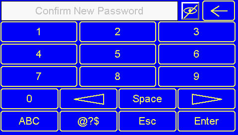
Enter New Password
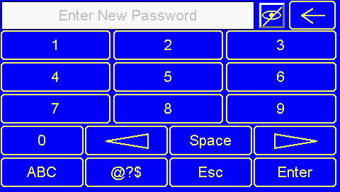
Enter the New Password and press Enter.
Confirm New Password
Show/Hide Password
Enter the new password again and press Enter. Show/Hide Password
The New Password and Confirm New Password fields include Show/Hide Password (eye) icons. Click the eye icon to display the entered password. Click it again to hide the password and display it as masked characters.
After the password is successfully changed, a confirmation message is displayed.
Access Restriction
The current user can change the password of users belonging to lower-level groups.
A user cannot change the password of another user belonging to the same group.
Delete User
The Del User button allows an authorized user to delete a selected user.
Select the user to be deleted and press Del User. A confirmation message is displayed.
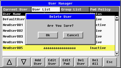
Press OK to delete the selected user or Cancel to cancel the operation.
Access Restriction
The current user can delete users belonging to lower-level groups. A user cannot delete another user belonging to the same group.
Delete All Users
The Del All button allows a user belonging to the Admin group to delete all users.
Press Del All to display the confirmation message.
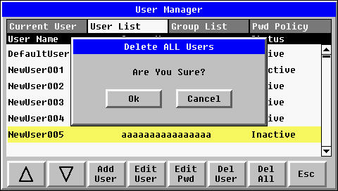
Press OK to delete all users or Cancel to cancel the operation.
Note: The Delete All operation is available only to a user belonging to the Admin group.
Group List
The Group List tab displays the groups available to the currently logged-in user.
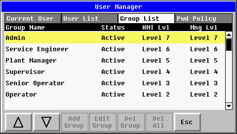
The Group List displays:
-
Group Name
-
Status
-
HMI Level
-
Mgmt Level
The groups displayed are determined by the current user's HMI Access Level and User Management Access Level.
Groups with a higher User Management Access Level or a higher HMI Access Level than permitted for the current user are not displayed.
Groups with lower applicable access levels are available according to the current user's permissions.
Password Policy
The Pwd Policy tab displays the password policy configured in Cscape and downloaded to the OCS device.
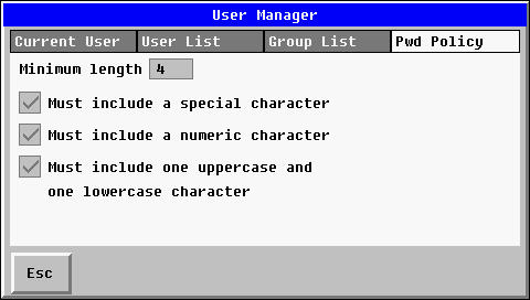
The password policy can display the following settings:
-
Minimum Length
-
Must include a special character
-
Must include a numeric character
-
Must include one uppercase and one lowercase character
The displayed settings reflect the password policy configured for Enhanced User Access in Cscape.
Note: On Prime, the password policy is displayed directly on the screen. A separate Save option is not displayed for the Password Policy tab.