Menu Object 
Note: For Canvas Series see Menu Object for Canvas .
See also: User Interface
See also: Graphic Object Toolbox
Topic Menu
Overview of the Menu Object

|
Using the Cscape Menu Object |
The menu object allows access to register / variable values, sub-menus and screens in a menu style presentation. Since a menu object can be virtually larger than the screen (scrollable), this object is especially oriented to smaller dimension screens that can only display a limited number of items. That is, register / variables can remain grouped together on a single screen while being accessible by simply scrolling the menu up or down. The menu object generally contains one or more menu entries (lines) and an optional legend. Each menu entry (line) contains an item prompt on the left and an item value on the right. The user may scroll through the menu lines and (if enabled) select and edit the item value. The item prompt is highlighted when that line is selected, and the item value is highlighted when it is being edited. Menu item values may be presented in one of several different formats such as numeric, floating point, (enumerated) text, ANSI text, or time/date. In addition, an item value may be either editable or read-only.
Alternately to displaying an item value, a menu entry can be configured to instead invoke a sub-menu or screen jump when selected. This allows menu items to be sub-divided and grouped together under a specific sub menu or screen. When accessing sub-menus, the previous menu (and selection context) is stored in a queue (up to 8 menus deep) such that the user can return to the previous level typically by pressing the ESC key. Note that if the Sub-Menu Selection Register is used by the application to select the current sub-menu, the sub-menu queue is cleared.
When creating screen jumps, the corresponding screen jump item attributes include an option Allow ESC to Return. When this option is selected and a screen jump from this object occurs, the user may return to the screen containing this menu object typically by pressing the ESC key. Note that on returning to the screen containing the menu object, the previously selected item context is NOT saved. The general attributes dialog box for this object includes an option Show Icon. When this option is selected, a sub-menu or screen jump Icon is displayed with the corresponding item prompt.
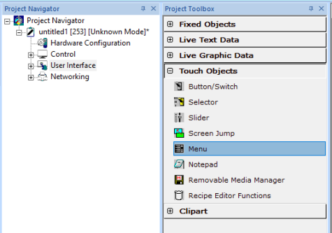
The menu object allows access to register/variable values, sub-menus and screens in a menu style presentation. The Menu Object can be accessed through the Home > Project Toolbox > Touch Objects > Menu. User must be on a Screen and not in the Main work area in order to see the Objects Project Toolbox items.
Menu Object Configuration
Displays and formats a scrollable window of prompts and data, which may or may not be editable. Essentially allows access to a large amount of grouped data on small graphics based screens. Object also supports hierarchical order of sub-menus allowing access to even more data.
Note: Menu Object is not supported in all controllers.
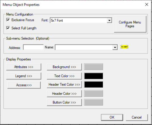
Menu Configuration

Exclusive Focus - Selecting Exclusive Focus check box specifies that only this object on a particular screen is to have (keypad) focus and prevents editing of any other objects on that same screen. When selected, the menu object immediately receives all cursor and numeric key presses (focus) when its corresponding screen is displayed. When exclusive focus is selected, the ESC key behaves as though no object is currently selected. That is, if the screen containing the menu object was activated through a screen jump object with Allow ESC to Return checked, pressing ESC (at the main menu level) causes a screen jump back to the calling screen. Otherwise, pressing ESC (at the main menu level) does nothing. If exclusive focus is NOT selected, the menu object must be selected to receive cursor and numeric key presses (focus). Once the menu object has focus, pressing ESC (at the main menu level) causes the menu object to loose focus and allowing other objects to be selected.
Select Full Length - This option causes the selected menu item to be highlighted for the full length of the menu object. Unchecking this option highlights only the menu item prompt (matches legacy system menu representation).
Font - Specifies the font used for the display of the menu’s (and sub-menus) prompt text and menu item.
Configure Menu Pages
Clicking on Configure Menu Pages opens the Menu Page Configuration dialog. This dialog allows the user to configure each menu item and create sub-menu pages. The dialog is divided into left and right panes.

Navigating the Menu Tree (Left Pane)
Selecting a sub-menu -If a sub-menu has been previously created, it may be selected from the tree display (left pane) such that its corresponding menu items are displayed under the Menu Items list (right pane). Right-clicking on the sub menu displays the following options:
-
Add Sub Menu – A sub-menu may be created by right-clicking the parent from the tree display (left pane) and then selecting Add Sub Menu item. Note that this method is a short cut for adding (Add button) a menu item type of Sub Menu Page (right pane) when the parent menu is currently being displayed
-
Rename Sub Menu - A sub-menu may be renamed by right-clicking the specific sub-menu from the tree display (left pane) and then selecting Rename Sub Menu item. Note that this method is a short cut for editing (Edit button) a menu item type of Sub Menu Page (right pane) when the parent menu is currently being displayed.
-
Delete Sub Menu - A sub-menu may be deleted by right-clicking the sub-menu from the tree display (left pane) and then selecting Delete Sub Menu item. Note that this method is a short cut for deleting (Delete button) a menu item type of Sub Menu Page (right pane) when the parent menu is currently being displayed.
Note: Cscape allows configuration of 24 sub menus only.
Editing Menu Items (Right Pane)
Menu items (lines) for a particular menu are added, modified, or deleted in the right pane of the Menu Page Configuration dialog. The current menu (sub-menu) being edited is displayed at the top of the list and also highlighted in the tree display (left pane).
-
Add - A new menu item may be created by clicking the Add button, which invokes the Menu Item Configuration screen. If a menu item is currently selected, the new menu item is placed immediately below it.
-
Edit - A currently selected menu item may be modified by clicking the Edit button, which invokes the corresponding Menu Item Configuration.
-
Delete - All currently selected menu items may be deleted by clicking the Delete button.
-
Move Up - The currently selected menu item may be moved up one position in the current list of menu items on each click of the Move Up button.
-
Move Down - The currently selected menu item may be moved down one position in the current list of menu items on each click of the Move Down button.
-
Copy - Copies the selected menu item(s) to the clipboard (remains in clipboard until Cscape is closed).
-
Cut - Cuts the selected menu item(s) to the clipboard (remains in clipboard until Cscape is closed).
-
Paste - Pastes the last copied menu item(s) below the currently selected item.
-
Expand Sub Menu – Expands the sub menu that is selected and displays the menu items configured in the selected sub menu.
Enables
Menu items of the menu page can be enabled/disabled dynamically if a register / variable is entered here. Bit 1 of the register / variable mentioned corresponds to menu item 1 and Bit 25 corresponds to menu item 25. If the corresponding bit of the register / variable is 1, the menu item is enabled and is shown on the controller screen else it will not be shown on the controller screen.
Note: Total of 377 menu items can be added / configured including sub menu's.
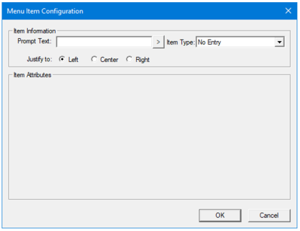
Add
Selecting Add button displays the following Menu Item Configuration window. This dialog is used to create a menu item (line), which usually consist of an item prompt, and an item value.
-
Prompt Text - The prompt is simply text that is presented to the user defining that line’s purpose. User can either directly enter the text from keyboard or select " > "which displays “select a character to insert” window wherein user can select individual characters that needs to be inserted.

-
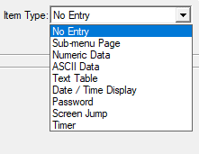
Item Type - The item type defines the action of that menu line, which may be none (display prompt only), display value (presented in numeric, string, password or text table formats), invoke sub-menu or screen jump. Most item types require additional configuration data (Item Attributes) that is specific to the type. Drop down displays the available item type formats that can be configured.
Note: For more information on formatting, refer to individual graphics object properties. See: Graphic Object Toolbox for Canvas Series
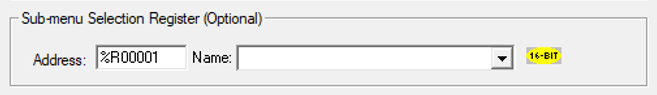
Sub-menu selection Register (Optional)
-
This option allows program control over the navigation through sub-menus. If a register / variable is specified (i.e. %R23) for this option, then this register / variable is automatically updated at run-time to contain the current index of the sub-menu being displayed. This index is zero based in that zero indicates that the base menu is currently being displayed. Then, when the user changes to a sub-menu, that sub-menus index is reflected in the Sub-menu Selection Register. The Cscape editor assigns indexes as sub-menus are added.
-
The Sub-menu Selection Register / Variable can also be written by the program to control either access to certain sub-menus or force the display of a specific sub-menu. For example, if a non-privileged user attempts to navigate to a protected sub-menu, the application can detect that sub-menus index in the Sub-menu Selection Register / Variable and immediately write zero to Sub-menu Selection Register / Variable to force the menu object back to the base page.
Note: If used, the Sub-menu Selection Register / Variable must be first-scan initialized to zero to allow the base menu to be initially displayed.
Display Properties for Menu Object
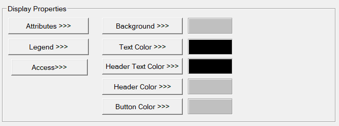
Attributes >>>

Static
Visible
-
Non-touch units* - all objects are always visible, so as a result both the static and dynamic override fields will be grayed out.
-
Touch units** - the visibility attribute may be set as static or dynamic.
-
*Non-touch units include X2, XLE, and XLEe.
**Touch Units include all XL series, Prime Series, and Micro OCS series controllers.
-
When the attribute is statically set to ON, the object is always visible and always responds to touch signals.
-
When the attribute is statically set invisible (unchecked) the object is not drawn but if the object is the front most object it responds to touch signals. For example, placing a statically invisible screen jump object in front of a bitmap allows the bitmap to be drawn but touching the location of the invisible screen jump causes the screen jump action to be performed.
-
When this attribute is dynamically enabled the visibility of the object is controlled by the associated bit in the override register. When the bit is ON the object is drawn and operates normally. When the bit is OFF the object is not drawn and does respond to any touch signals.
Flash – When statically set, an object will ’Flash’ the data display continuously or the animation ICON when the associated control register is in the ON state. When dynamically overridden, a three-state display can be created: OFF, ON solid and ON flash, depending both on the state of the control register and the Override Register.
Enable Input – This attribute, optionally available only as dynamically overridden, allows the object or the object editor to ignore keystrokes directed to that object. This allows run-time determination on whether to restrict input access to that object. This allows the user to create operator privilege or in-motion lockout of object modification. If this box is NOT checked, the associated object always accepts input.
Show ICON – This attribute, available only statically on certain objects such as the Switch, Menu and Screen Jump object provides the option on whether to display the ICON.
Dynamic
Color – This attribute allows some objects to dynamically change colors. Up to four additional colors can be selected for an object. If none of the color attribute override bits are set the object defaults to the color chosen in the main object properties.
Override variable – This register / variable is used to control the dynamic properties like visible, Flash, Enable Input and Colors.
Legend >>>

-
Text – User can configure a descriptive text (legend) to be included with-in the objects bounding rectangle. Returns may be inserted for multiple lines.
-
Insert Special Char >>> - Selecting this option displays the following window wherein user can select different fonts / special characters available to be added in legend.

-
Justification – This option is used to display the legend text in the configured position within a graphic object.
-
Font – User can select the available fonts / font size to be applied to legend text.
Access >>>
User can select access level from 0 to 7 in the drop down as shown. User logged in with the configured Access level (of graphic object) only will have access to that particular graphic object. NOTE: Default access level is 0 (Zero) for all the access level supported graphic objects.
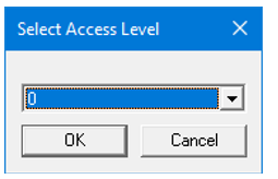
See also: Security & Passwords
Background Color / Image >>>
Selecting Background Color / Image >>> button displays the following window.
Note: Only Solid color will be available and all other options like Gradient, Pattern and User image will be grayed out if the graphic object is in non-editable mode.
Background >>> - Displays the Color Picker window.
Solid Color – Applies the selected color from color picker as solid background color for the graphic object. Selecting Background >>> displays the following Color Picker window.
Gradient - Allows user to select start and end color to be configured which in turn displays the configured color as gradient to the background color of graphic objects. Selecting Gradient Start Color >>> or Gradient End Color >>> displays the Color Picker window.
Color Picker
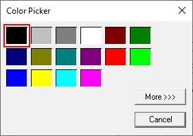
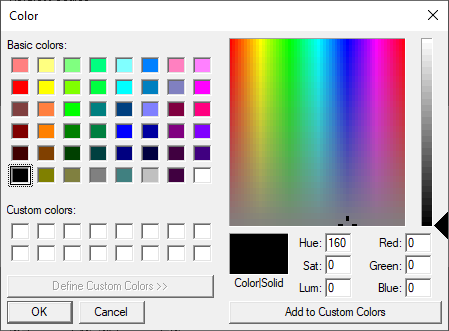
Selecting More >>> displays the following window allowing user to select color apart from default colors available in the above displayed color picker window.
Text Color>>>
Selecting Text Color>>> displays the Color Picker window.
Header Text Color>>>
Selecting Header Text Color>>> displays the Color Picker window.
Header Color>>>
Selecting the Header Color>>> button displaysthe Color Picker window.
Button Color>>>
Selecting the Button Color>>> button displays the following window:
Return to the Top: Menu Object